Satori CSS Limitations: What's Supported and What's Not
The last post looked at why @vercel/og drops emoji from your Open Graph images. That is not a one-off bug. It is a symptom of how the whole thing works. The engine underneath @vercel/og, next/og and the default renderer in nuxt-og-image is Satori, and Satori is not a browser. It converts HTML and CSS into SVG using a flexbox layout engine, and it implements a deliberately small subset of CSS. Emoji is one thing that subset leaves out. This post covers the rest, so you know why a card that looks right in Chrome can break, or quietly render wrong, the moment Satori touches it.
The short version of Satori's CSS limitations, checked against the Satori readme in August 2026: layout is flexbox only, with no CSS grid, no pseudo-elements, no selectors or stylesheets, no media queries, no z-index and no viewport units, and every font has to be passed in by hand as TTF, OTF or WOFF. A property-by-property support table is further down if that is what you came for.
Satori is not a browser
Satori uses the same flexbox layout engine as React Native, the Yoga engine, and it is clear in its own docs that this is not a complete CSS implementation. @vercel/og wraps it: Satori produces the SVG, then it is rasterised to PNG, the whole thing designed to run in an edge function. You can read the supported list in the Satori readme and Vercel's OG image docs.
The mental model that saves you time is this. You are not writing CSS for a browser. You are writing for Yoga plus a curated set of properties. Almost every surprise comes from assuming browser behaviour that Satori never promised.
Everything is flexbox
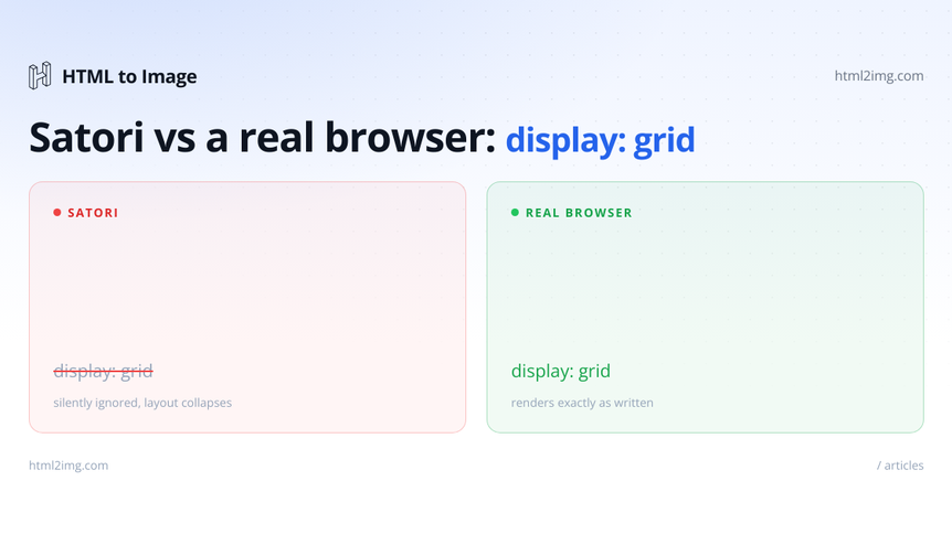
The headline limit is layout. In Satori, display is flex, contents or none, nothing else. There is no block, no inline-block, no table and, the one that catches most people, no grid. Vercel's docs say it plainly: advanced layouts using display: grid will not work.
Because the default is flex and there is no block flow, any element with more than one child has to declare its display explicitly. Leave it out and you get the error every Satori user has seen:
import { ImageResponse } from '@vercel/og'

new ImageResponse(
  <div style={{ color: 'white' }}>
    <h1>Title</h1>
    <p>Subtitle</p>
  </div>
)

// Error: Expected <div> to have explicit "display: flex" or "display: none"
//        if it has more than one child node.
Running this in production? Get an API key with 50 free credits, no card needed.
The fix is to say what you mean:
<div style={{ display: 'flex', flexDirection: 'column', color: 'white' }}>
  <h1>Title</h1>
  <p>Subtitle</p>
</div>
CSS Grid is the bigger adjustment. You rebuild every grid as nested flex containers. A two column layout is a row with two half-width children:
<div style={{ display: 'flex' }}>
  <div style={{ display: 'flex', width: '50%' }}>Left</div>
  <div style={{ display: 'flex', width: '50%' }}>Right</div>
</div>
A card grid is a wrapping flex row with fixed-width children:
<div style={{ display: 'flex', flexWrap: 'wrap', gap: 16 }}>
  <div style={{ display: 'flex', width: '33.33%' }}>Card</div>
  <div style={{ display: 'flex', width: '33.33%' }}>Card</div>
  <div style={{ display: 'flex', width: '33.33%' }}>Card</div>
</div>
Most grid patterns do translate, but you carry the translation in your head and your markup grows a layer of wrapper divs.
Positioning and units are limited too
position supports relative, static and absolute only. There is no fixed and no sticky, which makes sense because Satori renders to a fixed canvas, not a scrolling viewport. For the same reason, viewport units do not work: vw, vh, vmin and vmax are silently ignored. Size things in pixels and percentages instead.
There is also no z-index. SVG paints in document order, so an element that comes later in the markup sits on top. If you need one thing above another, order the markup that way rather than reaching for a stacking context. Two dimensional transforms work, but three dimensional ones do not.
No selectors, pseudo-elements or media queries
You style with inline styles. There are no stylesheets, no class selectors, no :hover or :focus, no media queries and no ::before or ::after. The pseudo-element one bites hardest in practice, because so many designs lean on ::before for a decorative bar, an overlay or a quotation mark. In Satori you draw those as real elements:
// A ::before accent bar becomes a real child element
<div style={{ display: 'flex', flexDirection: 'column' }}>
  <div style={{ display: 'flex', width: 64, height: 6, background: '#818cf8' }} />
  <h1 style={{ marginTop: 24 }}>Heading</h1>
</div>
@vercel/og lets you use Tailwind through a tw prop, which feels like a way out, but it compiles down to the same inline subset. A class that maps to an unsupported property is still unsupported. Tailwind changes the syntax, not the boundaries.
Fonts and text have their own rules
There are no system fonts. If any text renders, you have to pass the font data yourself as an ArrayBuffer or Buffer:
new ImageResponse(<div style={{ fontFamily: 'Inter' }}>Hello</div>, {
  width: 1200,
  height: 630,
  fonts: [
    { name: 'Inter', data: interArrayBuffer, weight: 600, style: 'normal' },
  ],
})
Satori reads TTF, OTF and WOFF. It does not read WOFF2, which trips people up constantly because Google Fonts serves WOFF2 by default, so a font that loads fine in a browser fails here. Advanced typography such as kerning, ligatures and other OpenType features is not supported, and right-to-left scripts are not handled. Emoji, as the emoji post covered, have to be loaded as graphics through loadAdditionalAsset, because there is no emoji font in the box.
All of this competes for space. @vercel/og runs in an edge function with a 500KB bundle limit, and that budget covers your JSX, CSS, fonts and images. Every extra font weight and emoji asset you load eats into it, so a card with two or three weights and a logo can run out of room faster than you would expect.
The failures are usually silent
The explicit display: flex error is loud. Almost nothing else is. An old-version gap, a vh, a backgroundSize, an em font size: these tend to do nothing at all rather than throw, so the only way to map the edges is trial and error against the OG playground. Satori does give you one debugging aid, a debug flag that draws the layout boxes:
new ImageResponse(element, { width: 1200, height: 630, debug: true })It is worth saying that the subset has grown. Flexbox gap and background-size: cover work in current versions where they did not a couple of years ago, CSS custom properties are supported now, including fallbacks and inheritance, and the repeating gradient functions, repeating-linear-gradient and repeating-radial-gradient, sit in the supported list alongside their plain counterparts after years of being a documented gap. Answers written a couple of years ago will tell you the repeating variants do not work; the current readme says they do. The specific gaps move. The model does not. You are maintaining a template in a dialect of CSS whose boundaries you find by hitting them.
The full support table
Everything below is checked against the Satori readme as of August 2026. The subset grows slowly, so treat the unsupported rows as the current state rather than a permanent verdict, and spot-check the readme if you are reading this long after publication.
Feature | Status in Satori |
|---|---|
|
|
CSS Grid | Not supported. Rebuild as nested flex containers |
Flexbox ( | Supported. |
|
|
| Not supported. Later elements paint on top |
Width, height, min and max sizes | Supported, except |
Margin and padding | Supported |
Borders and | Supported. Border style is |
| Supported |
Gradients |
|
| Supported. |
CSS variables | Supported, with fallbacks and inheritance |
Transforms | Two dimensional only. No 3D transforms |
| Supported |
Selectors, classes, | Not supported. Inline styles only |
| Not supported. Draw them as real elements |
Media queries, | Not supported |
Viewport units ( | Not supported, silently ignored |
Fonts | TTF, OTF and WOFF as buffers. No WOFF2, no system fonts |
OpenType features (kerning, ligatures) | Not supported |
Right-to-left text | Not supported |
Emoji | Not built in. Load through |
JavaScript, | Not supported |
What Satori does well
To be fair, the supported subset is enough for a great many cards. Flexbox layout, absolute and relative positioning, padding and margin and gap, borders and border radius, box shadow and opacity, linear and radial gradients, background images by url, two dimensional transforms, text-overflow: ellipsis with line clamping and CSS variables all work. Satori is fast, deterministic and runs at the edge, which is exactly why @vercel/og chose it. If your OG cards live inside that subset, it is a good tool and there is no reason to move.
The limits only bite when you bring a richer browser layout to it and expect the browser to show up.
When to render with a browser instead
If your design needs the parts Satori leaves out, CSS Grid, pseudo-elements, media-query variants, WOFF2 or system fonts, emoji without manual loading, real OpenType typography, then stop fighting the subset and render with a real browser engine. This is the same conclusion the emoji post reached. A browser runs the whole CSS platform, so the card you build in the browser is the card you get back.
The tradeoff is honest. You give up Satori's edge-function model and call a browser instead. The HTML to Image API does that as a hosted request. You POST the HTML and CSS and get a PNG, with grid, pseudo-elements, web fonts and emoji all working, because the render happens in real Chromium:
const res = await fetch('https://app.html2img.com/api/html', {
  method: 'POST',
  headers: {
    'Content-Type': 'application/json',
    'X-API-Key': process.env.HTML2IMG_API_KEY,
  },
  body: JSON.stringify({
    html: `<div style="display:grid; grid-template-columns:1fr 1fr; gap:24px;">
             <div>Grid works here</div>
             <div>So do ::before and web fonts</div>
           </div>`,
    width: 1200,
    height: 630,
  }),
})

const { url } = await res.json()
If you are weighing the two for a Next.js project, the walk-through on dynamic OG images in Next.js without @vercel/og sets the API approach next to the Satori one. The Open Graph image template is a ready starting point, and there is a no-code Open Graph image generator if you want to design a card without writing the markup first.
Outgrowing Satori's CSS subset and want OG cards rendered in a full browser engine? Browse the templates gallery or read the docs to get started.

Written by
Mike Griffiths
Mike has spent the last 20 years crafting software solutions for all kinds of amazing businesses. He specializes in building digital products and APIs that make a real difference. As an expert in Laravel and a voting member on the PHP language, Mike helps shape the future of web development.